
Boxplots#
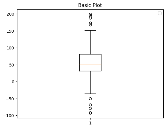
Used to represent descriptive statistics, a box plot depicts groups of numerical data as quartiles. Box plots are sometimes called box-and-whisker plots because they can include lines extending from the boxes (whiskers) to show variability outside upper and lower quartiles. Box plots are a standardized way of displaying summary statistics for a dataset.
Statistics represented in a box plot include:
minimum: lowest data point (excluding outliers); 0th percentile or Q0
maximum: highest data point (excluding outliers); 100th percentile or Q4
median: middle value in the dataset; 50th percentile or Q2
first quartile: also known as the lower quartile; median of the lower half of the dataset; 25th percentile or Q1
third quartile: also known as the umper quartile; median of the upper half of the dataset; 75th percentile or Q3
In the process of calculating these summary statistics, a sixth value is calculated, the interquartile range, which is the distance between upper and lower quartiles.
%matplotlib inline
import matplotlib.pyplot as plt, numpy as np # import statements
from matplotlib.patches import Polygon

spread = np.random.rand(50) * 100 # create sample data
center = np.ones(25) * 50
flier_high = np.random.rand(10) * 100 + 100
flier_low = np.random.rand(10) * -100
data = np.concatenate((spread, center, flier_high, flier_low))

data # show data
fig, axs = plt.subplots() # create figure and axes
axs.boxplot(data) # draw plot
axs.set_title('Basic Boxplot') # set title
plt.show() # show output
WARNING:matplotlib.legend:No artists with labels found to put in legend. Note that artists whose label start with an underscore are ignored when legend() is called with no argument.
Additional Resources#
For more on box plots: