
Bar Charts#
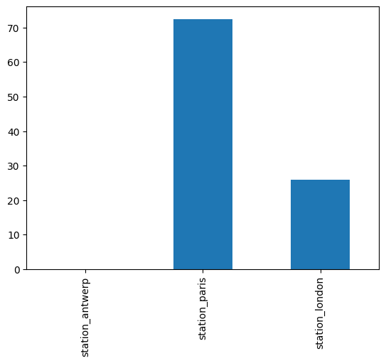
Let’s say we want to create a bar chart with a single line of data from our df DataFrame. We can select a specific row using iloc.
import pandas as pd, matplotlib.pyplot as plt, numpy as np # import statement
df = pd.read_csv('https://raw.githubusercontent.com/kwaldenphd/elements-of-computing/main/book/data/ch10/air_quality_no2.csv', index_col=0, parse_dates=True) # load data
# create bar plot for single row of data
df.iloc[5].plot.bar()
<Axes: >
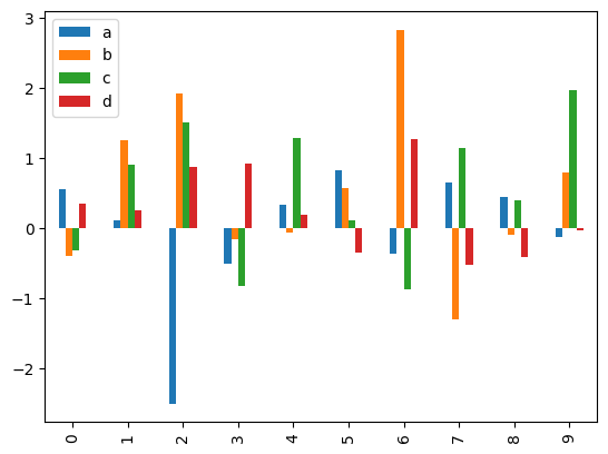
Grouped Bar Chart#
Let’s say we want to produce a grouped bar chart. We can create a DataFrame with four columns and random values. By default, .plot.bar() creates a separate bar for each of the numeric columns. We could select a single column using [''] to only show one bar or column value.
df2 = pd.DataFrame(np.random.randn(10, 4), columns=['a', 'b', 'c', 'd']) # create dataframe
df2.plot.bar() # grouped bar chart with categorical data
<Axes: >
Stacked Bar Chart#
If we wanted to show this data as a stacked bar chart, we would set the stacked parameter to True.
df2.plot.bar(stacked=True) # stacked bar chart
Horizontal Bar Chart#
Remember .plot.barh() generates a horizontal bar chart, and we can also set stacked to True here to create a horizontal stacked bar chart.
df2.plot.barh(stacked=True) # horizontal bar chart
Additional Resources#
For more on bar charts: