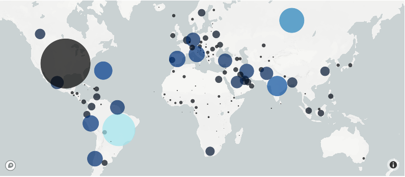
px.scatter_mapbox()#

Now we can use the px.scatter_mapbox() function to add point data to our figure. This example takes the open-street-map base map from the previous section and adds point data for 1,000 US cities with the highest population count.
import pandas as pd, plotly.express as px # import statement
us_cities = pd.read_csv("https://raw.githubusercontent.com/kwaldenphd/elements-of-computing/book/data/ch12/us-cities-top-1k.csv") # load data

# create figure
fig = px.scatter_mapbox(us_cities, lat="lat", lon="lon", hover_name="City", hover_data=["State", "Population"],
                        color_discrete_sequence=["maroon"], zoom=3, height=300)

fig.update_layout(mapbox_style="open-street-map") # update basemap
fig.update_layout(margin={"r":0,"t":0,"l":0,"b":0}) # update layout
fig # show figure
We specify which fields in the us_cities dataframe include latitude and longitude information (lat and lon). We set a color sequence with discrete colors. But since no field is assigned for a color attribute, all points are the same color.
Customizing#
If we wanted to color the points based on population size, we would want to switch to a continuous color scale.
# color points based on population value
fig = px.scatter_mapbox(us_cities, lat="lat", lon="lon", hover_name="City", hover_data=["State", "Population"],
                        color_continuous_scale=px.colors.sequential.Viridis, mapbox_style="open-street-map",
                        color="Population", zoom=3, height=300)

fig # show figure
If we wanted our point size to be based on the population value, we would modify the size parameter.
# size points based on population value
fig = px.scatter_mapbox(us_cities, lat="lat", lon="lon", hover_name="City", hover_data=["State", "Population"],
                        size='Population', mapbox_style="open-street-map",
                        color="Population", zoom=3, height=300)

fig # show figure
Another example that uses rideshare data for Montreal. In this example, point size is based on the number of car hours (car_hours) and point color is based on time of day (peak_hour).
# load data
df = px.data.carshare()

# create figure
fig = px.scatter_mapbox(df, lat="centroid_lat", lon="centroid_lon", mapbox_style="carto-positron",
                        color="peak_hour", size="car_hours", color_continuous_scale=px.colors.cyclical.IceFire, size_max=15, zoom=10)

# show figure
fig.show()
We pass the entire dataframe to px.scatter_mapbox and specify which fields include geospatial information. We set color and size and assign a maximum size for the points.
Color Maps#
plotly includes a number of built-in discrete and continuous colormaps. To learn more about the built-in colormap options:
