
Pie Charts#
Pie charts don’t play as nicely with DataFrames, because they only accept one-dimensional data (values with attributes) and a DataFrame is a two-dimensional structure.
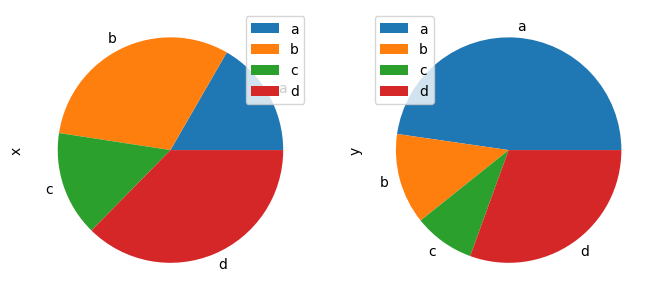
One option is to generate a subplot for each column.
import pandas as pd, numpy as np # import statements
df = pd.DataFrame(3 * np.random.rand(4, 2), index=["a", "b", "c", "d"], columns=["x", "y"]) # generate data
df.plot.pie(subplots=True, figsize=(8,4)) # show plot
array([<Axes: ylabel='x'>, <Axes: ylabel='y'>], dtype=object)
The other option is to isolate a subset of the data to get to a one-dimension data structure.
Let’s go back to our air quality data.
df = pd.read_csv('https://raw.githubusercontent.com/kwaldenphd/more-with-matplotlib/main/data/air_quality_no2.csv', index_col=0, parse_dates=True) # load data
df.head() # inspect df
| station_antwerp | station_paris | station_london | |
|---|---|---|---|
| datetime | |||
| 2019-05-07 02:00:00 | NaN | NaN | 23.0 |
| 2019-05-07 03:00:00 | 50.5 | 25.0 | 19.0 |
| 2019-05-07 04:00:00 | 45.0 | 27.7 | 19.0 |
| 2019-05-07 05:00:00 | NaN | 50.4 | 16.0 |
| 2019-05-07 06:00:00 | NaN | 61.9 | NaN |
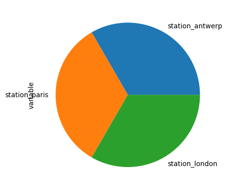
Let’s say we want to know what proportion of observations come from each station. We could use some of the aggregating and reshaping functions to get to a one dimensional structure.
df2 = df.melt() # melt dataframe
df3 = df2['variable'].value_counts() # get number of station observations
df3 # inspect output
station_antwerp    1035
station_paris      1035
station_london     1035
Name: variable, dtype: int64
df3.plot.pie() # generate pie chart
<Axes: ylabel='variable'>
Additional Resources#
For more on pie plots: